

What does PerkSpot even do?!
PerkSpot is a platform that offers exclusive discounts and perks to employees of partner companies. Kinda like a private Groupon!
This case study outlines a redesign that improved user engagement and satisfaction. The changes included easier navigation, an advanced search functionality, personalized recommendations, and a more efficient check-out process.
These updates led to increased user engagement and higher redemption rates, showcasing the success of user-centric design and iterative improvements.
What was the problem we were trying to solve? (key issues + defining success)
Key issues identified
No auto-suggestions or auto-complete ---> Users had to type full searches manually.
Limited search filters ---> no way to refine search results based on categories, brands, offers or price.
Poor relevance ranking ---> results didn’t prioritize top deals, causing users to scroll excessively.
No handling for typos or synonyms ---> A small misspelling led to "no results found."
Defining success and the solution
Set clear, measurable goals.
Collaborate with stakeholders to understand the business impact.
Conduct user research to uncover real needs.
Identify technical constraints.
Ensure alignment on project goals. What extra features of search do we want to include? (Auto-suggestions & auto-complete, filtering, spell check, category-based filters, brand based filters)
PerkSpot’s (poor) search functionality
So picture this…
1. You’re recently invited to join PerkSpot via your company’s benefit plan.
2. You must accept an email invitation, create a log in, and sign in before you can even
begin browsing
3. Once you begin to window shop, you notice the search functionality isn’t like what the
other big named competitors have.
4. You’re confused, frustrated, and eventually, you’ll just close the tab, right? Right.


There was no auto suggestion, no auto-complete, no filtering, no visually appealing results, no auto correct, and the probability of hitting a brick wall is greater than not.
UX Research & Insights
Google Analytics: 40% of our users abandoned search after the first attempt.
Hotjar heat-maps: Users frequently scrolled back and forth, suggesting difficulty finding deals.
User Interviews (50 participants): 70% expected search suggestions and filtering options.
Customer Service Feedback: CS team would often vocalize and show tickets from upset customers.
Competitive Analysis: Bench marked against competitors like Amazon, Redbubble, Rakuten, and Target.

Even if you misspelled your search, it would autocorrect automatically and display correct results (Amazon)

Provided Auto suggestions + auto complete (Rakuten)

Visually appealing results with brand names, logos, product images, prices

Filtering optioned embedded
What was the design process like?
As a designer: this was an exciting opportunity to be creative and to visualize as many concepts as possible for Web, iOS & Android. The world was my oyster.
Customer Service Insights: Reviewed insights generated previously from client-customer interaction.
Heuristic Analysis: Assessed the current PerkSpot platform and figured out what could be improved.
Affinity Diagram: Cluster together features based off out client and product management feedback to identify key areas that had the highest impact.
Research: Who are the users? What is the product? Desktop only or mobile? What are the goals?
Collaborate and build relationships: Collaborating with a principal UX designer, software engineers, multiple product managers and stakeholders.
Design: Using existing design systems, brainstorming on Figjam and designing in Figma before presenting my work.
Iterate & test: High-fidelity prototypes, QA environments.
Release: Desktop + iOS/Android.
Iterate & test pt 2: Gather feedback from Client Service team and user test.

various versions containing a mix of: category dropdowns, placeholder text, iconography, autofill, auto suggest, overall placement

mid-fidelity version to include trending searches, content cards, and sidebar products
Final Designs (Search Redesign)


^^Let’s flex on the results + data
Search Conversion Rate: 35% increase in users clicking on search results after an initial search.
Time to Find a Deal: Reduced by 40% on average - less time spent on the site due to successful finds.
Checkout Engagement: 25% more users completed a purchase after using search.
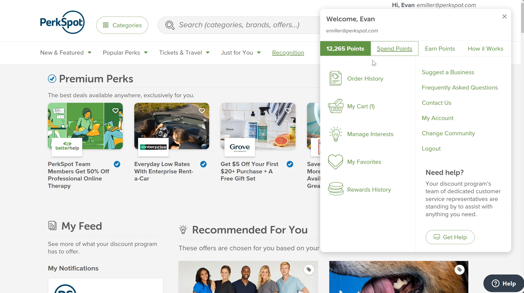
The PerkSpot Discount Portal
The Discount Portal, which is the main web product of PerkSpot, is highly popular among millions of active users across numerous employers nationwide. My role involved overseeing the design and production of all
user-facing features, collaborating with stakeholders, product managers, and developers.
I was responsible for helping maintain and updating the design system
that served as the foundation for the website.
The videos provided below offer a glimpse into the extensive range of features I have researched, designed, and successfully implemented during my time at PerkSpot.
Notably, the website is designed to be mobile-responsive and prioritizes compliance with
WCAG 2.1 AA guidelines.
My Roles
Planning & scope definition – Collaborated with product managers to uncover user insights, transform concepts, establish requirements, prioritize features, and define the MVP objectives.
Leadership – Delivered presentations of ideas, user research, and designs to stakeholders and product managers at PerkSpot to secure alignment
Experience strategy & vision – Crafted scenarios and low-fidelity prototypes to articulate the solution's vision, ensuring team alignment with the project goals.
Design execution & validation – Produced high-fidelity designs, prototypes, and detailed design specs.
Implementation – Worked with a development team and contributed directly to QA testing, ensuring the successful realization of my designs.
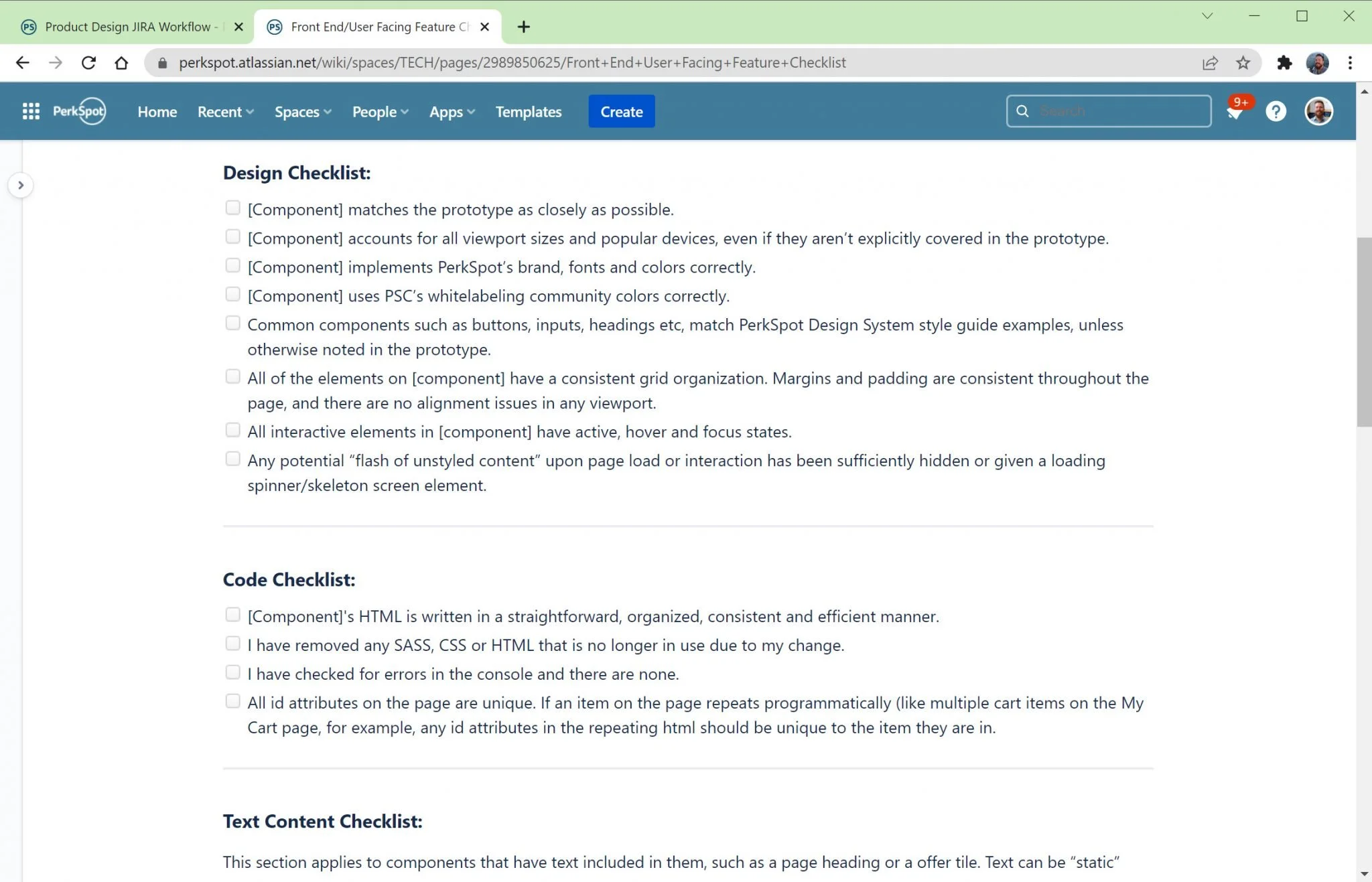
Workflow
With the Principal UX Designer at PerkSpot, we established a robust workflow that governs the design and development of user-facing products.
This well defined process ensures that the UX team are actively involved in each stage of the product design cycle, starting from initial concept to the final deployment.
By implementing this workflow, future (and current) UX Designers have the opportunity to contribute their expertise throughout the entire process.
Additionally, I worked on a straightforward checklist that is utilized by product managers, developers, and QA engineers. This checklist serves as a valuable tool to ensure that all user-facing features we release adhere to PerkSpot's designated Design and Accessibility standards. This helps maintain consistency and accessibility across our products, enhancing the overall user experience.

The PerkSpot Design System
The PerkSpot Design System is a comprehensive collection of styles, components, design patterns, tools, and best practices specifically crafted to streamline product design processes at PerkSpot. This Design System is implemented as a UI Kit within Figma, providing a resource for designers.
Importantly, the Design System is seamlessly integrated into every PerkSpot technology product, guaranteeing a 1:1 analog representation. This integration ensures that prototypes are constructed using reusable components and standardized design patterns, resulting in efficient development of consistent and accessible products.
“My Favorites” Figma Prototype
PerkSpot's "My Favorites" feature prototypes were efficiently developed in Figma using the PerkSpot Design System UI Kit. These prototypes outline various features and serve as a reference for developers during implementation.
Leveraging the UI Kit ensures swift creation for both the responsive PerkSpot Discount Portal and the Mobile App. Consistent use of the Design System across endpoints enables reuse of design patterns, enhancing consistency and streamlining the design and development process.
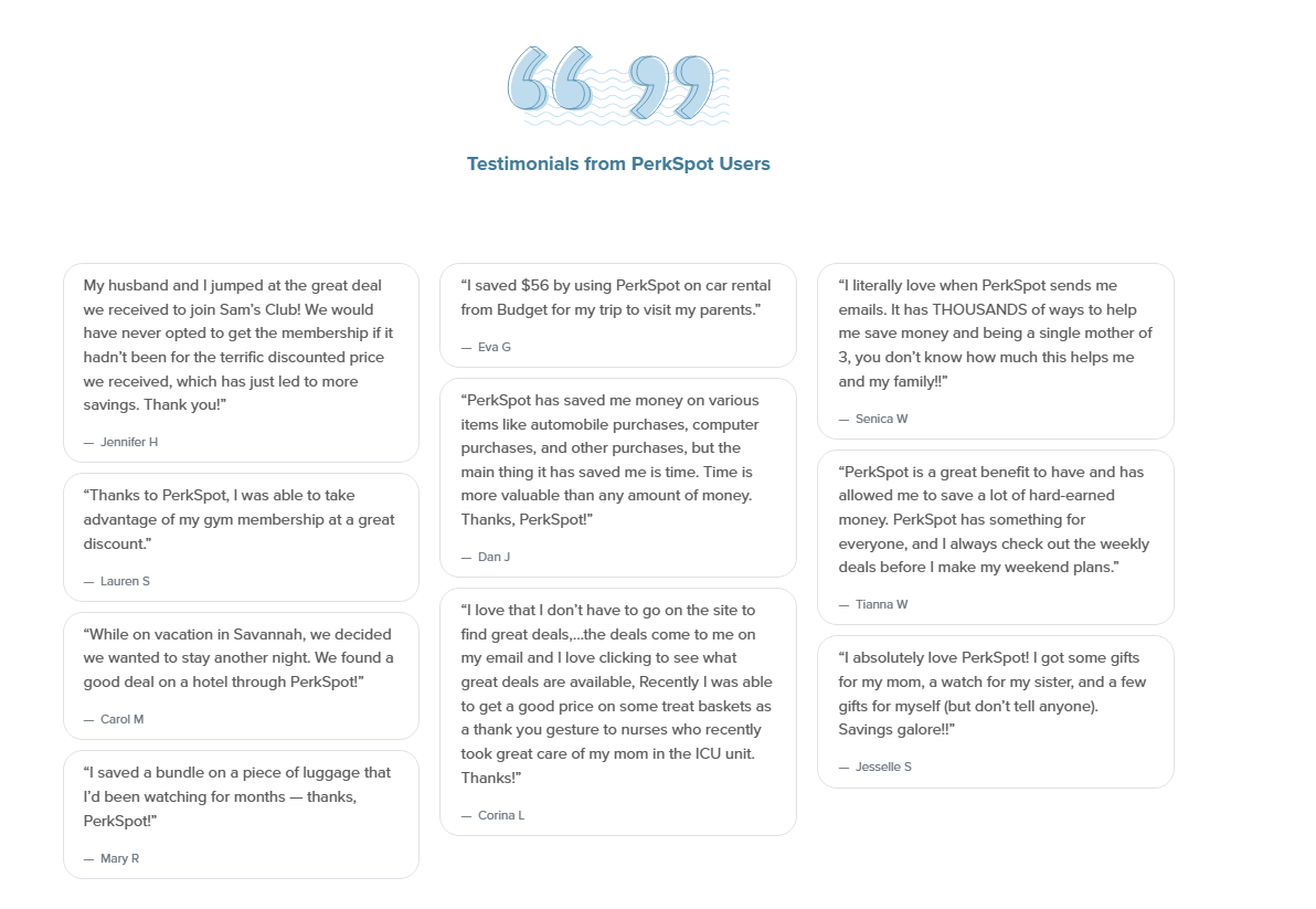
Results
The redesigned PerkSpot platform led to increased user engagement, higher redemption rates, and improved overall satisfaction among employees accessing perks through the platform.
“I literally love when PerkSpot sends me emails. It has THOUSANDS of ways to help me save money and being a single mother of 3, you don’t know how much this helps me and my family!!”
Senica W
Reflection + Outcome
Reflection: The success of the PerkSpot redesign underscores the importance of user-centric design, iterative prototyping, and
continuous improvement in creating a compelling user experience.
Outcome: By implementing these proposed enhancements, PerkSpot aims to enhance user satisfaction, increase engagement, and ultimately drive higher adoption and retention rates among both employees and partner companies.